Chart of the Week
Russell 2000 Growth vs. Russell 1000 Growth
Five stars, four turns, and a fifth star that just printed. That's our chart of the week from last week's session: the Russell 2000 Growth versus Russell 1000 Growth ratio going back to 2014 with stars marking each 150-day relative extreme. The theme of the week was “Signal vs. Noise,” and this chart sits firmly in the signal column.
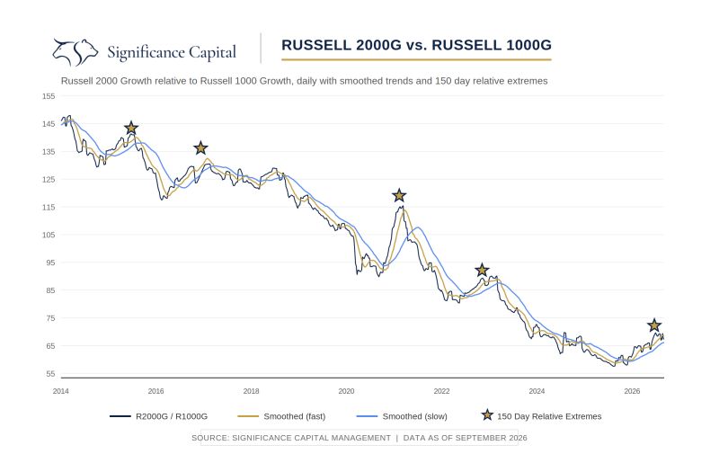
Here's the part worth sitting with. The first four stars each marked the top in small versus large almost perfectly. Mid 2015, late 2016, early 2021, late 2022. Different markets, different backdrops, same result. Small caps' moment of maximum strength against large caps was also the moment it ended. And the outcomes for the broader market alternated, negative, then positive, then negative, then positive. The common thread is simpler than it looks. Whatever trend was running hot into the extreme is the trend that got reversed.
That fifth star is the one we care about now. We've already seen small caps back away from it, and one of our higher conviction views from here is that small caps are likely to lag large caps going forward. What that means for the whole market is genuinely two sided. If mega caps take the baton, and their long-term base breakout looks constructive, you could get a narrower advance that still carries the indices higher. If instead this is another peak in risk appetite, and we think the peak in risk taking for this cycle is likely behind us either way, then the defense matters more than the offense from here. We're watching the cyclicals for the tiebreaker since past momentum unwinds have tended to show up close to cyclical peaks.