Chart of the Week
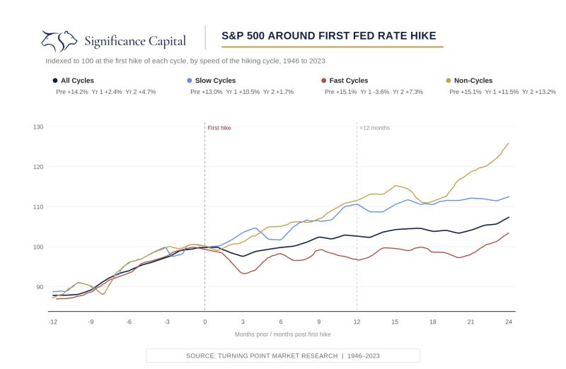
S&P 500 Around First Fed Rate Hike
So, the Fed hiked. Now what? That was the question hanging over Friday's session, and our chart of the week has the most honest answer we've found. It shows the S&P 500 around the first Fed hike of every cycle since 1946, split by what came after. The punchline is that the first hike itself tells you almost nothing. Slow cycles saw the market up 10.5% a year later. One-and-done non-cycles were even better at 11.5%. Fast cycles, where the Fed keeps hiking meeting after meeting, were the only bad outcome, down 3.6%. Wednesday's hike was priced at better than 90%, so the market barely blinked. The path from here is what gets priced next.
Meanwhile, the tape keeps doing something worth respecting. Rates, oil, fed hike, negative seasonality, record short positioning in Nasdaq futures, bearish sentiment near cycle extremes, and the index is still flirting with all-time highs. There's an old Paul Tudor Jones rule that goes when the market has every reason to go down and refuses, it's like holding a beach ball underwater. The longer it's held down the less news it takes to make it jump. With positioning this offside, the fuel for that kind of move is sitting right there.
Our job from here is watching the things that decide which cycle this becomes. If oil rolls over and the 10 year holds below 5%, the case for a slow hiking cycle gets stronger, and with the AI earnings cycle broadening out, the setup into year-end could be a good one. If oil and rates keep pressing, the fast-cycle path opens, and history says that's the one to respect.