Chart of the Week
Russell 2000 Value vs. Russell 2000 Growth
Last week's Charting the Course carried the theme “The Battle Rages On.” The battle in question is equities versus commodities. We think a secular bull market in commodities started back in 2020, and the bull market in stocks obviously never ended. History says those two don't share the throne for long. One of them usually wins, and a lot of our work right now is about figuring out which one is winning. Our chart of the week takes that question down to the small caps.
It's the Russell 2000 Value versus Russell 2000 Growth ratio going back to 1997. Here's what makes it interesting. Small caps and large caps almost never turn at the same time. At most big inflection points they diverge, sometimes by a month, sometimes by half a year or more. In nearly thirty years of data there are exactly two dates where small and large cap growth versus value turned together, March 7 of 2000 and August 11 of 2006.
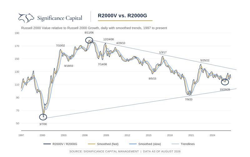
Both turned out to be secular turning points, the kind that set the direction for years. Those are the first two circles on the chart. The third circle is October 29 of 2025. That's the day this small cap ratio bottomed, and it lines up to the day with the turn we've tracked in the large cap relationships all year. Same sync, third time in three decades.
Add in the higher low here while large cap growth pushed to a fresh extreme, and we read it as one more piece of evidence that a major shift in investor preferences may be underway, toward value, toward commodities, toward hard assets. Is it a sure thing? No. Turns this size take quarters, sometimes years, and the volatility can grind on a while.
But if this is what it looks like, the asymmetry in the value and commodity trade is the kind you might see once a decade, and we'd rather be early and watchful than late and surprised.